
We usually think about mobility and immobility in physical terms: a person, a star, an object goes from A to B or remains in one spot. Yet, movement and stillness can be imagined too.
Think for instance about the current pandemic. As citizens across the world are ordered to stay at home, they seek to ‘escape’ physical confinement through imaginary forms of traveling. Projects, such as the Facebook page ‘View from my Window’ cater to this desire: it offers a virtual experience of travel through photos looking out from people’s windows.
This desire to move or ‘be moved’ when physically still goes back thousands of years. Theatrical or musical performances, science fiction works, and virtual reality simulations are designed to transport us to faraway places and times, whether in the past or in the future, whether real or imagined. At the same time, performances or artefacts can bring distant events closer. Take for instance, this hand coloured engraving from early nineteenth-century France, when the country was ruled by Napoleon I.
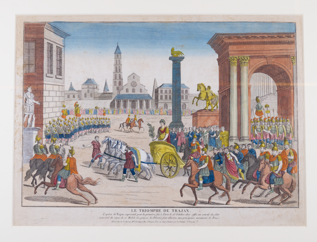
Hand-coloured engraving from the procession scene in the opera Le triomphe de Trajan. Published by Chéreau in Paris c. 1807. Private Collection, copyright Dr Annelies Andries.
The image was made to be seen through a zograscope, a popular optical instrument from around 1800. Its magnifying lens enhances a picture’s depth and made viewers feel as if transported into the scene. In this case, it was a scene from the opera Le triomphe de Trajan (1807), specifically the triumphant return of the Roman Emperor Trajan after the Dacian Wars (c. 105-106). This was the most spectacular scene of the opera; it featured real horses, hundreds of performers, breathtaking costumes and a mindblowing reproduction of the ancient Forum Romanum. In the video below, Dr Annelies Andries reveals more about this image and how the fascinating zograscope is used:
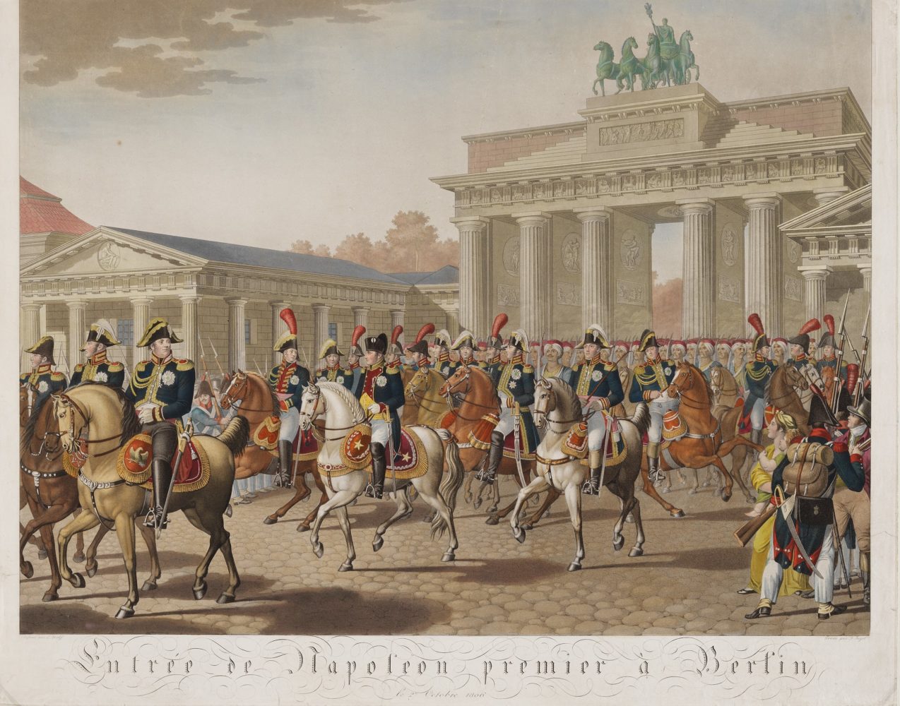
Viewers of the engraving could thus imagine themselves witnessing this celebrated opera scene. Or they could picture themselves as attendants at Trajan’s procession itself (as some of the opera’s audiences had). Yet, there was another option, the plot of Le triomphe de Trajan was modelled on Napoleon’s victory over Prussia in 1806. Thus, viewers could also imagine themselves attending Napoleon’s triumphant entry into Berlin. A depiction of this event can be seen below. Click on the dots to discover more:
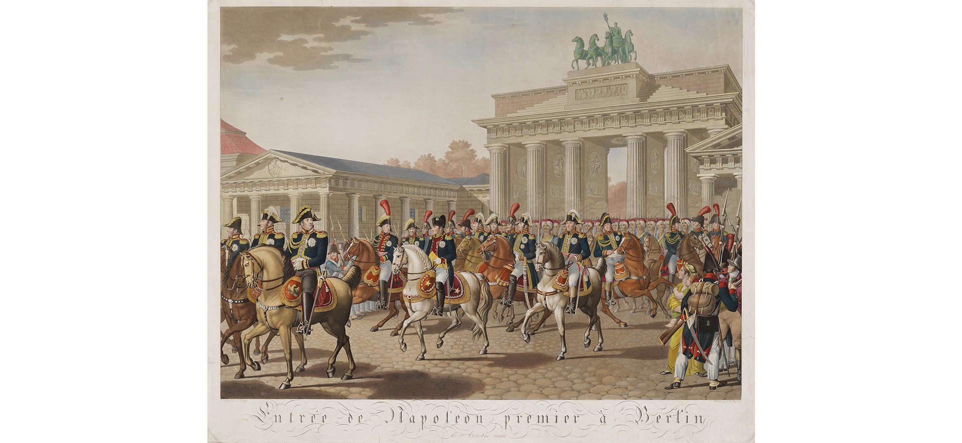
Although constructed by the Prussian King Frederick William II, Napoleon was the first leader to use the gate for a triumphal procession. After the procession depicted here, the famous quadriga (or chariot) was taken to Paris. It would remain in Paris until Napoleon's eventual defeat in 1814.
The fall of Berlin was a major blow to Prussian military leadership. The memory of French troops pouring into the centre of the capital destroyed the reputation of the strong Prussian army. Indeed, this scene became an iconic scene in German culture, used for decades afterwards to call for revenge against France.
Interestingly, Napoleon does not have a gold-rimmed hat and wears a less ornate long-skirted coat than his generals. This was his custom as he styled his image to accentuate his ‘humble’ origins and it is also said that it was a sign of respect for the former Prussian king Frederick the Great, whom he admired and whose grave he visited while in Berlin. He reportedly declared that “If he were alive, we wouldn’t be here today".
[“Entrée de Napoléon premier à Berlin”. Copyright: Deutsches Historisches Museum, Berlin (Inventory Number 96004329). Image used until 29/10/2026 with the kind permission of the museum.]
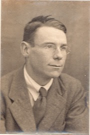
George Henry Bonner. Photograph by Alvin Langdon Coburn. Fintry Trust Executioners (out of copyright).
Art can also help process experiences of movement or stillness, whether physical, imaginary or both. This is true for the poetry by George Henry Bonner (1895-1929).
Bonner was an undergraduate at Magdalen College between 1914 and 1920, interrupting his studies to serve in the First World War. In 1917, he suffered from shell shock and was taken in at the Craiglockhart Hospital in Scotland. There, medical personnel encouraged artistic activity for its therapeutic effects. Bonner’s poems underline the different ways mobility is experienced during war. In ‘The Pilot’s Song’ (1916) (pictured below left), the ecstatic feeling of flying a fighter’s plane is followed by the uneasy stillness of a home emptied by war. An even starker confrontation between an imaginary of joyful mobility and a reality of immobility is found in the poem ‘Let us taste of the Joy of Battle’ (pictured below right). The soldier’s envisioned brave run into battle is frustrated in reality by his fear, which makes him incapable of moving.
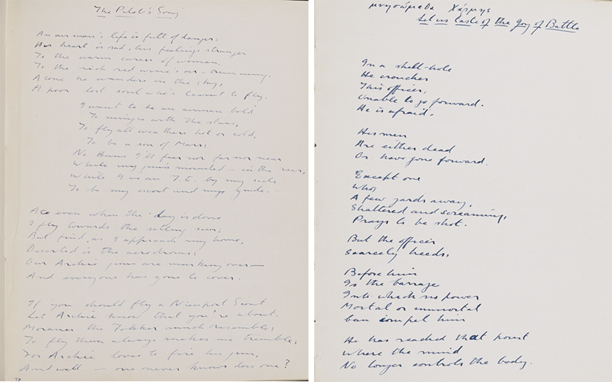
Left Image: George Henry Bonner, “The Pilot’s Song” (5 April 1916), P429/MS22/3. Right image: George Henry Bonner, “Let us Taste of the Joy of Battle” (3 November 1917), P429/MS22/4. Both images: Copyright Magdalen College Archives.
Both poems reveal the contrast between war propaganda and the reality of battle. Images of heroic movement forwards, triumphing over the enemy, are used to mobilise citizens. Yet, such simplified representations did not align with the complexity of soldiers’ experiences: they could be stationed somewhere without seeing action, immobilised by fear in battle, running after an enemy without ever encountering them, and so on. How the mind is crucial to these experiences is expressed in the poem ‘Invocation’, published in The Hydra, the journal magazine of the inmates at Craiglockhart Hospital (pictured here). It strikingly describes the wanderings of the mind, its inability to be still and find peace — a poetic impression perhaps of the impact of shell shock.
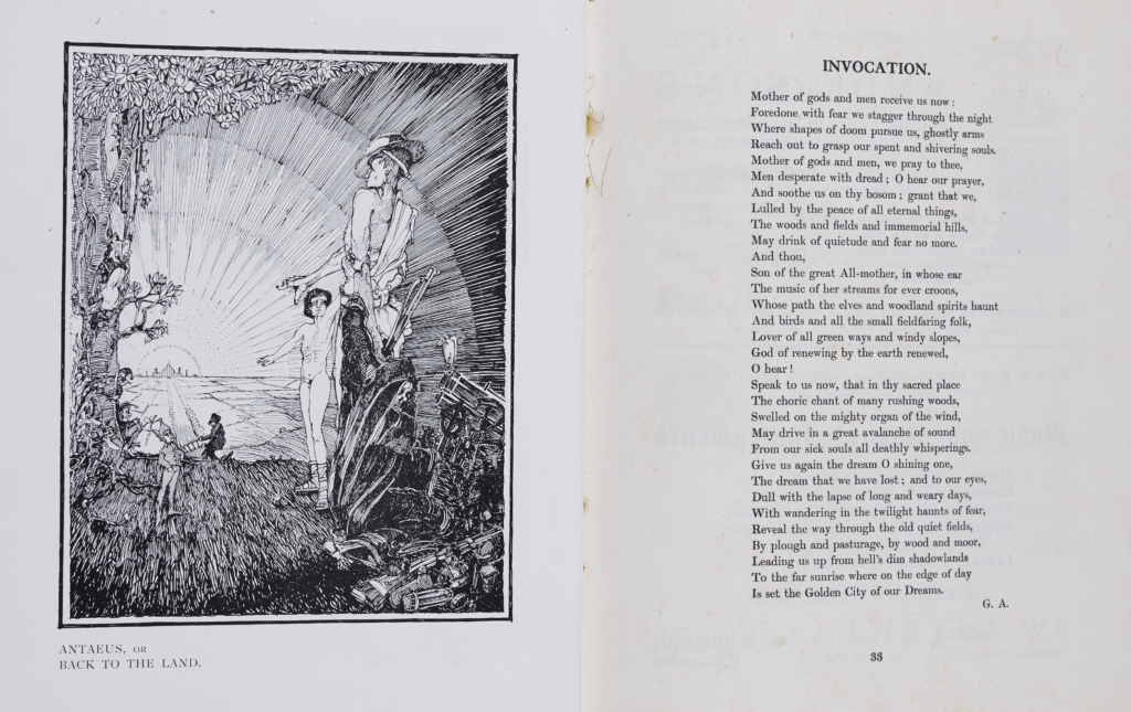
“Invocation”, poem attributed to George Henry Bonner. Printed in The Hydra: The Magazine of the Craiglockhart War Hospital. Copyright Magdalen College Archives, P429/N4/3
Imagined experiences of mobility and immobility are not solely the domain of art. Data projections also often use the representation of movement to imagine (or rather predict) the future course of events. This data ‘auralisation’ by Alan Smith OBE (Data Visualisation Editor, Financial Times, 2017- ) uses musical pitches to represent monthly bond interest rates (‘yields’) over several decades. Watch the video below to discover more:
Economists argue that when shorter-term bond rates are higher than longer-term rates (a ‘yield curve inversion’), this signals public pessimism about future performance — and usually precedes recessions. Listen carefully, and hear how Smith represents these yield curves with shifting series of tones. Based on what you hear, do you think we are experiencing an inversion now?
In a less abstract manner, representations of journeys can also incorporate projections of a future or endpoint. The thirteenth-century Mappa Mundi of Hereford, for example, includes a vision of Christian Europe’s path towards the Last Judgment. Click on the dots to discover more about this fascinating map. You can also learn more about the map and its history on this excellent website, created by Hereford Cathedral.
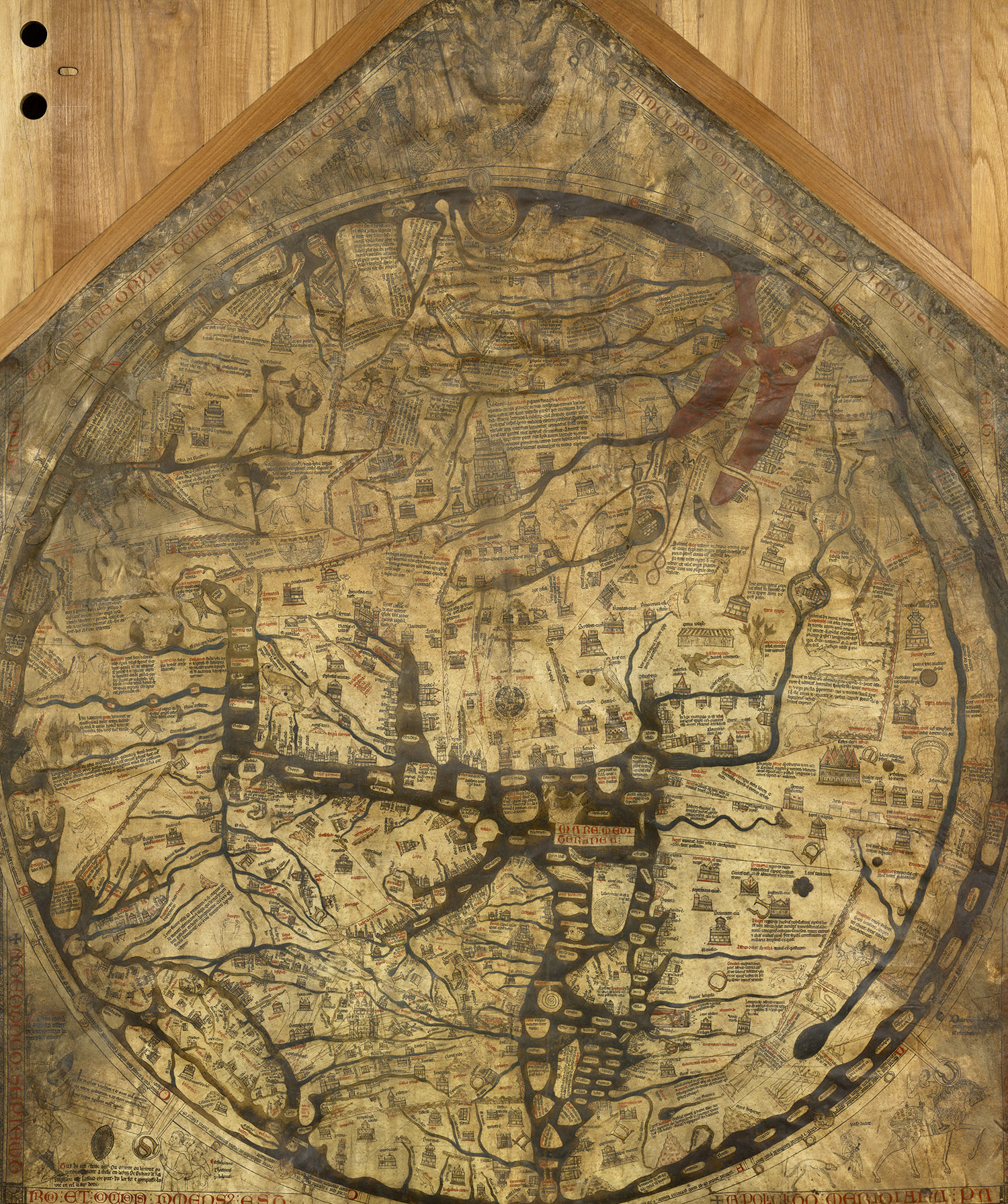
Above the map, Christ looks down on humanity in all his majesty.
The map includes several drawings of mythical beasts. Particular highlights include this unicorn and dragon.
Jerusalem serves as the centre point of the map, acting as the spiritual centre for the inhabited world. It is represented with a circular battlement wall.
Hereford itself appears on the map as a small building on the banks of the River Wye. Interestingly, the city has almost been erased over the centuries. Scholars believe this erasure may have been caused by the fingerprints of thousands of pilgrims pointing to the city when they saw the map.
Although two-dimensional, the Mappa Mundi is apt for our exhibition as it depicts movement. This amazingly-preserved red water represents the Red Sea. The clear pathway you can see here represents the parting of the Red Sea by Moses in the Book of Exodus. As a result of this, Moses could lead the enslaved Israelites out of Egypt and into the Promised Land.
The sea in the middle of the map is the Mediterranean. When translated literally into English, Mediterranean means 'the sea in the middle of the Earth', reflecting its importance in medieval culture as the central highway of the known world.
In comparison to modern maps that point North, the Mappa Mundi points East. Here, you can see an Elephant at the edge of the known world. Such creatures would have been regarded as mythical beasts far away to the West in Hereford!
[“Mappa Mundi”, a Medieval Map of the world. c. 1300. Copyright: Hereford Cathedral. Image used with the kind permission of Hereford Cathedral Library and Archives]
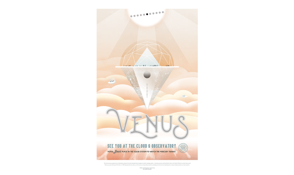
Today, several industries capitalise on the human tendency to make projections about how they will experience the journey. Travel posters specifically capitalise on this desire and NASA has used this genre and aesthetic to promote its agency through its Visions of the Future series. These posters imagine human journeys to various planets. Explore a selection of these images below in a gallery that moves from the Sun to the furthest reaches of the solar system:


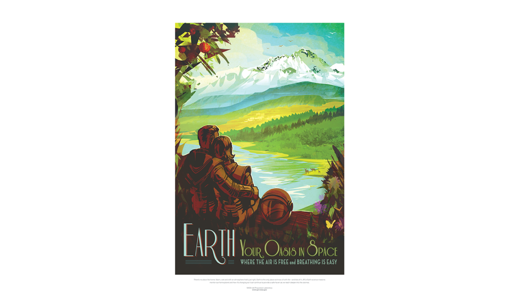
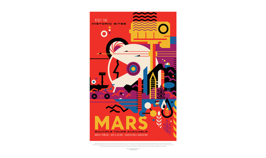
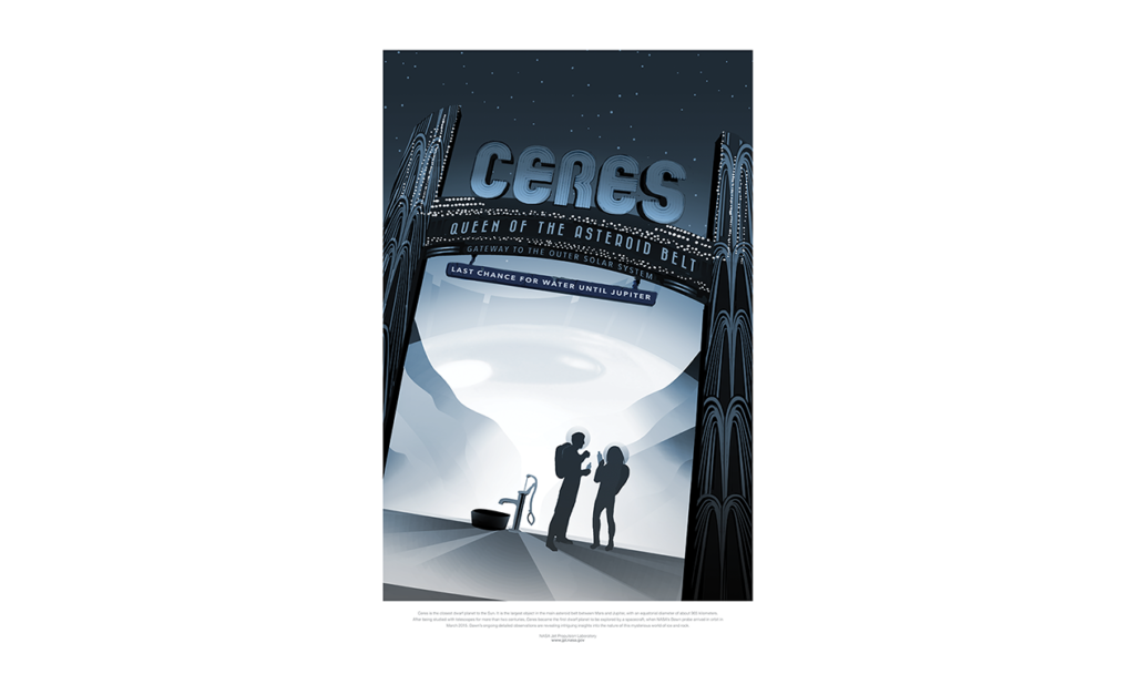
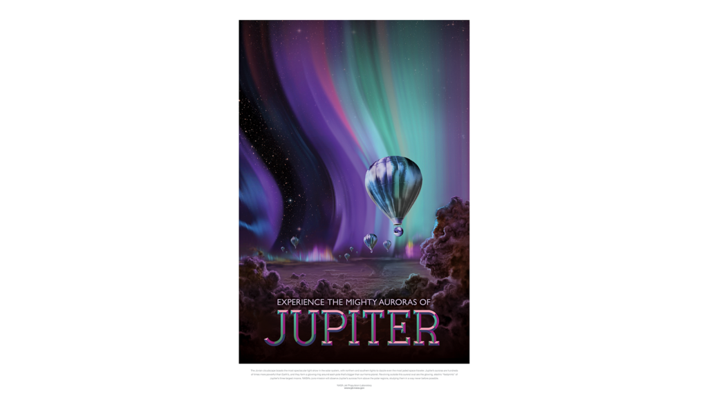
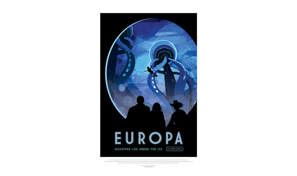
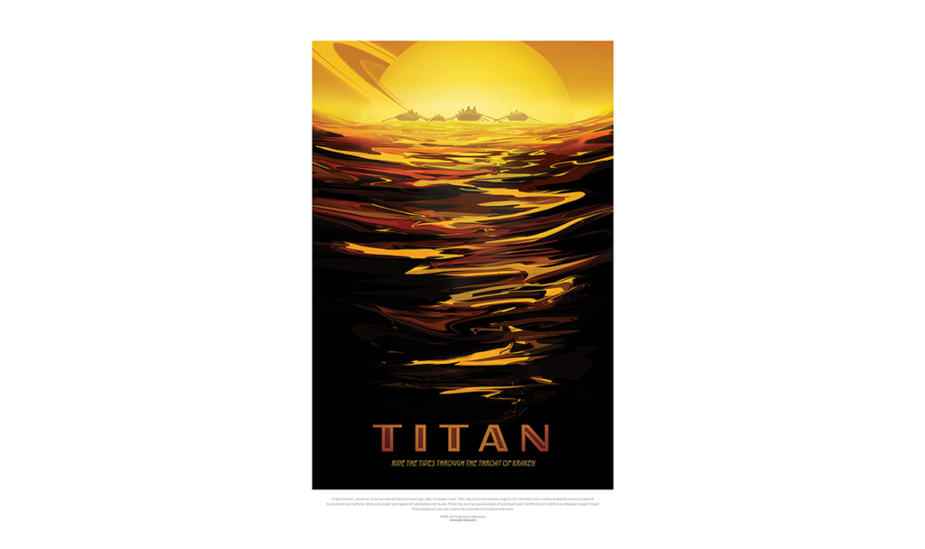
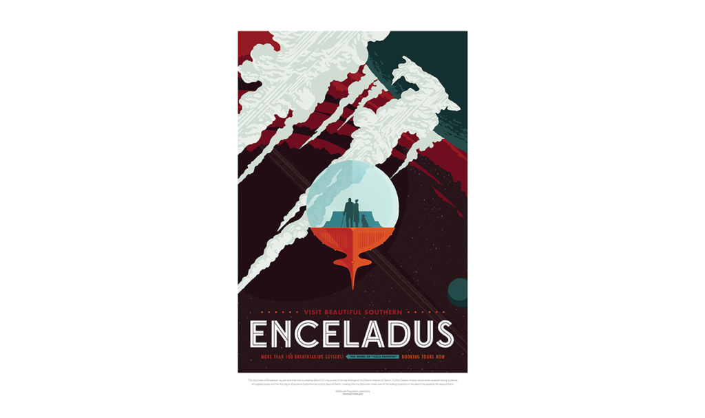
[Visions of the Future: NASA/JPL posters envision our visits to the universe. Copyright: Jet Propulsion Laboratory, California Institute of Technology. Images used in accordance with the JPL Image Use Policy.]
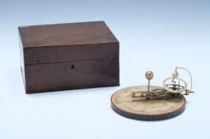
“A New Portable Orrery”, made by W. Jones in London. Late Eighteenth Century. Inv. 51011. Copyright: History of Science Museum, University of Oxford
Imagination has helped us grapple with the constant dialectic between mobility and immobility. It may seem counterintuitive, but from the perspective of the Universe, we are always already moving. The earth spins about its axis (500 m/s), rotates around the Sun (30,000 m/s), orbits the Galaxy (250,000 m/s) and flies through the Universe (630,000 m/s). But how do we account for this movement while gravity provides us with a physical sense of stillness? Since Copernicus spread the idea of our heliocentric universe in 1543 , orreries have been a popular manner of representing these movements (see above right).
And today, virtual reality simulations provide more absorbing experiences of this continuous movement within stillness. In the video below, you can take a virtual reality tour of six exoplanets. Click and drag to move around 360 degrees!
Our imagination is vital to confronting our own mobility and immobility and that of the world around us. This page shows a glimpse of how these experiences have been conceptualised and expressed, whether in words, pictures, or sounds, whether illusory or data-driven, whether scientific or artistic – a breadth that highlights the human capacity for creativity and resourcefulness. How do you experience movement and stillness? Can you think of ways to conceptualise these experiences?
Add your thoughts on the following “Have your say” page…